Prometric Web Application
Prometric Computer based Test Centre
Prometric is a U.S. company. They sells a range of services, including test development, test delivery, and data management capabilities.
Opportunity
Prometric had a legacy application where sponsor, author and admin people create, manage and conduct tests. Users faced usability and performance issues in existing legacy application and could not able to complete task easily.
Prometric planned and initiated to redesign the application. I got chance to work with Prometric to bring best solution.
Team
Across all cross functional team members I was considered and placed as interaction designer and got chance to work with this project. I had supportive team who worked in business analysis, UI and development.
Process
Discovery
Me and team dived into redesign the application with a kick off meeting, started my research through stakeholder interview, I defined our goal to improve usability and user experience by providing good design solution for the target users are candidates, authors and sponsors. I made strategic plan to create unique features and new value proposition to meet competitive market.
Then I conducted contextual inquiry, observed users tasks when interacting with legacy application, conducted user interviews followed to gather user feedbacks and insights.
My Findings
During our contextual user interview, users shared their perspectives on improving the quality of their work. They told us about what they needed, how it worked now, and where things sometimes go wrong.
- Authors and other users struggled in finding relevant menu to do tasks
- Facing difficulties on reviewing and pro-acting in running tests
- Unnecessary steps need to be completed when creating tests, and there is no proper way to come back to home screen from where they started
- The information architecture, labeling and call to action buttons were very poor
Then I did competitive analysis to compare strengths and weakness of the applications to set bench mark for business goal. I checked performance of competitors like meritrac, examonline with Prometric using similarweb online tool and derived competitor’s data to set bench mark.
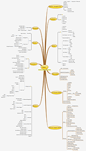
Mindmapping 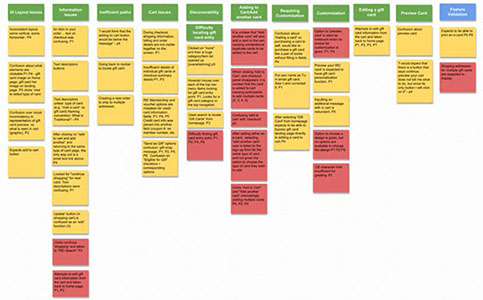
RESEARCH ANALYSIS
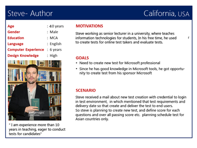
Then I started analysis on our findings, designed personas for each user group ex. sponsor, admin, author and candidates, in which I listed out user goals, motivations, and pain points with scenarios.
Created user journey maps for each persona and I mapped user activities, thoughts and feelings for each stage gate what user felt and faced through their journey in contextual inquiry.
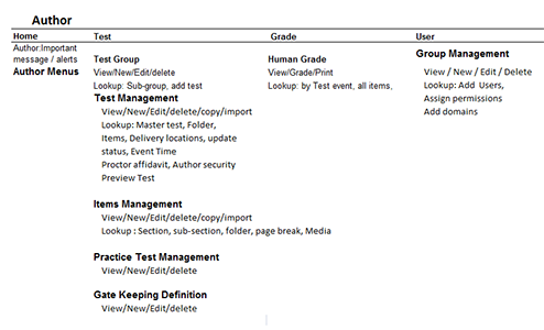
I conducted brainstorming meetings to analyze on our findings I extracted snippets from our interview notes and placed them on a wall formed Affinity diagram to group ideas and solutions, Then I wrote this grouped ideas as label in cards to evaluate with users, I conducted card sorting so that collect feedbacks about our menu and label groupings, based on user feedback, generated information architecture.
Finally I set UX and business metrics from all research and analysis data to generate design solutions.
Design
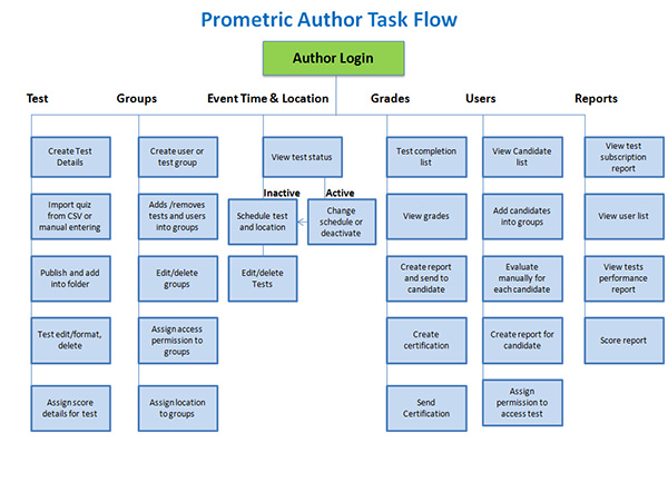
With research findings in hand, created task flow diagram for each user scenario ex. Author how he can create test, publish and schedule test for candidates, if the user is candidate, how he can enroll test for certification, how he can complete tests simply in the first visit.
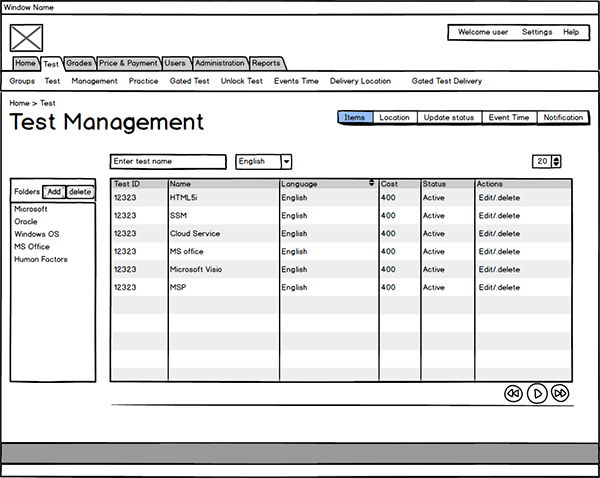
From task flow diagram I started to create low fidelity wireframe in which represented organized structured navigation menus, prioritized content and space allocation for features. I iterated with users and stakeholder to bring earlier feedback and insights.
After initial low fidelity wireframe iteration, I created high fidelity prototype in Axure, prototypes designed with real feel interactivity and intuitive UI to improve affordance to test with users and validated the predefined UX and business metrics.
I tested flows, visuals, and prototypes with users through remote screen sharing to ensure everything looked beautiful, worked well, and made sense. If not, they’d let us know, and I’d refine and test again until I got an air-tight experience.
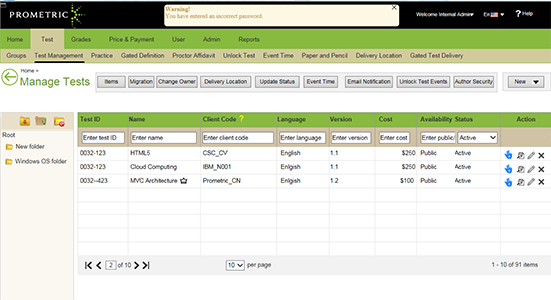
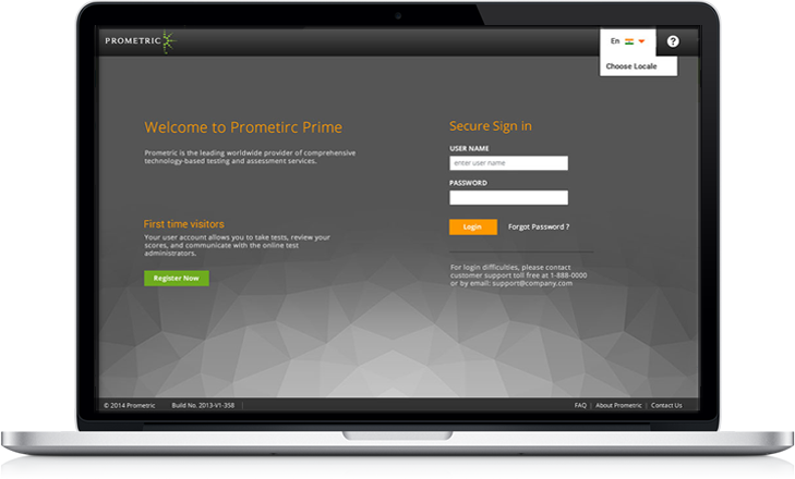
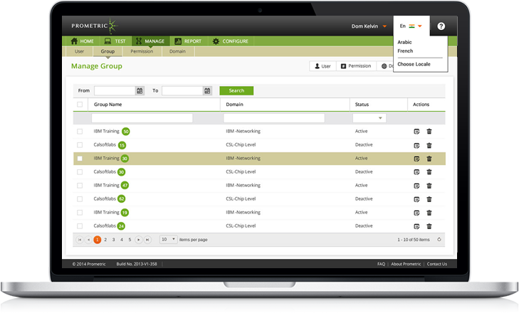
Final Prototype
After much iteration and testing with user and stakeholder, the final prototype delivered to development team who are creating UI screens in HTML, CSS, Bootstrap framework for further development.
Outcome
- Information architecture, menus and sitemap has been well defined for each type user.
- Removed unnecessary steps in task flows where users could achieve desired goal efficiently, our design solutions made user performable, convertible, fulfill its purpose.
- Modern and aesthetic UI screen and elements implemented where users can perform its functions without much learning.