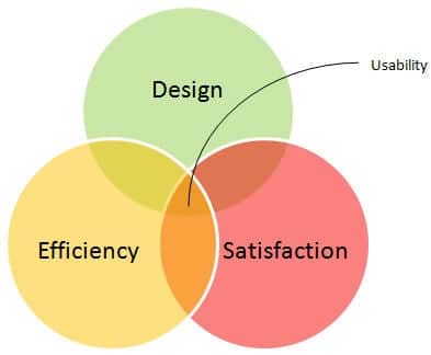
User are encountered to interact various people and products where they want to feed input and get output daily basis , during this interaction they easily recognize things which they want to interact or sometime they use memory to retrieve relevant information continue interaction. So there are two parts involved each interaction which are recognition and recall. The first one recognition happens easily based on familiarity, second one recall requires memory process which can be varied based on contextual. To make ease of interaction and improve good user experience, cognitive load needs to be reduced.
The Nielsen statement as follows
Recognition rather than recall
Minimize the user’s memory load by making objects, actions, and options visible. The user should not have to remember information from one part of the dialogue to another. Instructions for use of the system should be visible or easily retrievable whenever appropriate.
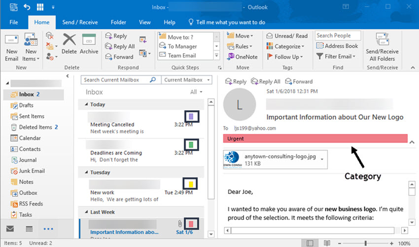
Example , you open outlook mailbox there find mail list , send mail, reply button everything upfront ,you can easily recognize and interact with the tool where users don’t use use much memory .but another example if user use command line tool where want to change filename or folder name, required memory to retrieve the commands to change filename. The memory of data retrieval depends other factors, memory will be effective based on activation of data which involves practice and recency of usage, context.
Memory activation is depends upon amount of practice you do, recency how far away you practiced the data, context how the data interconnected with other memory.
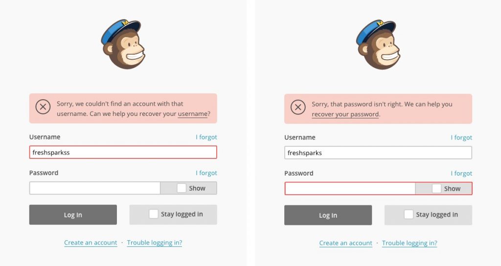
Context is based on association, example most of people create passwords with other associated data, like name with data of birth, or combination of first and last name to make ease of memory.
Recall on interface requires memory load which may increase cognitive load and its leads frustration when interact with system. Creating recognition based user interface and its components which would be reduced memory process and leads friction less interaction.
Promote Recognition in User Interfaces
How do you promote recognition? By making information and interface functions visible and easily accessible.
A product usually has two components:
The Interface: the combination of buttons, navigation, and other elements which help the user reach his goal
Content information that the user needs to achieve his goal
You can make both the content and the interface easy to remember; both can benefit from designing for recognition rather than recall. Some examples can be listed which would supporting retrieval of information through recognition.
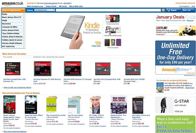
E commerce websites, Google listing history, items recently visited and searches performed in the near past.
These screenshots reveal the humble beginnings of some of the world’s biggest websites. The homepages of internet heavy-hitters like Amazon, Twitter and Youtube – which receive millions of hits per day – at the time of their launches are almost unrecognisable to today’s web users. These early versions of some of the world’s most clicked-upon sites look incredibly basic compared to their present-day counterparts. With their plain colour schemes and emphasis on text rather than images, it’s hard to believe that they developed into the colourful, content-heavy pages that millions log on to every day. (Credit; newsteam).
Visible, Intuitive Graphic User Interface
Command-line interfaces are an example of interfaces that are based on recall. Graphical user interface that are based on recognition which would have visible, intuitive graphical elements.
kathirg.com | UX Design Project Management Consultant | Agile Scrum who coach empiricism framework from Chennai Tamilnadu India