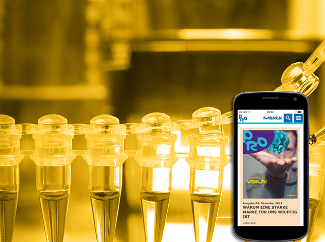
Merck & Co., Inc. is an American pharmaceutical company and one of the largest pharmaceutical companies in the world. Merck & Co. publishes The Merck Manuals, a series of medical reference books for physicians, nurses, and technicians. These include the Merck Manual of Diagnosis and Therapy, the world’s best-selling medical reference.
Goal
Merck planned to automate the publishing the magazine to simply the publishing the work of magazines.
They planned to use web scrapper tool which automatically scrapes the web content and uploads in client website. Using the tool, planned to build application for web and mobile where authors simply enter URL of web content and publish e-magazine.
Team
Across all cross functional team members I was considered and
placed as UX Lead and got chance to work with this project. I had
supportive team who worked in business analysis, UI and development.
Process
Research
I received SRS document from client and after analysis of requirement, we had few sessions with stakeholder to get solid understanding of the project objective, goal and about target audiences.
Then we conducted user interview and discussed user experience with
other application what they earlier used. I asked some of questions and
probed to think aloud. I collected user feedbacks and insights and
recorded as reports.
User Pain Points
From our user interview, I came to know some following pain points which they are facing when reading with other e-magazines.
- Most of magazine uploaded as PDF which cannot be simply downloadable and readable from mobile.
- Most of articles and images not well formatted
- The sites not providing feature to bookmark and store for future reading.
- Authors need to manually copy the content or write for each article so they are not able to publish articles due to other busy task.
ANALYSIS
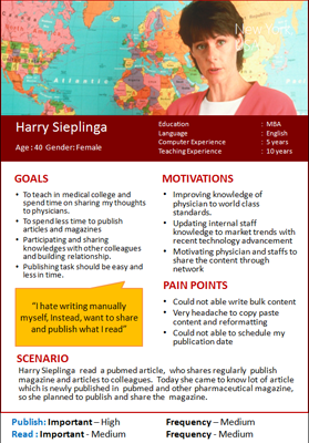
Then I started analysis on our findings, designed personas for each user group ex. author and readers, in which I listed out user goals, motivations and pain points with scenarios.
I conducted brainstorming meetings to analyze on our findings. I had hot discussion with stakeholder and other team members.
I wrote our ideas and placed on white board to analyze and review with other peers and generate new ideas.
Finally I set User and business metrics from all research and analysis data to create design solutions.
DESIGN
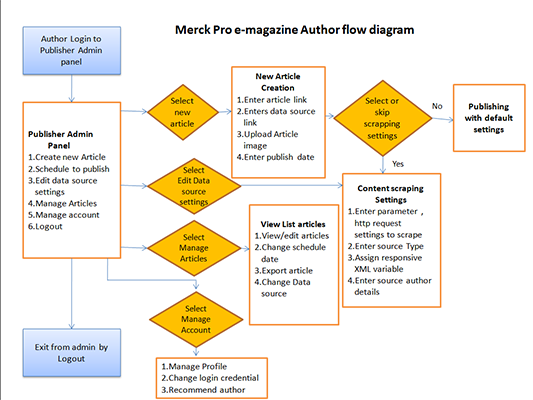
With research findings in hand, I began laying out Task flow diagram, I created task flow diagram for each user scenario ex. Author how he can create magazine, publish, if the user is reader, how he can simply access magazine content from his mobile, read, bookmark and share with friends.
From task flow diagram I started to sketch paper prototype. I tested paper prototype with persona users to validate usability and business metrics.
After initial low fidelity paper prototype iteration, I created high fidelity prototype in Axure, prototypes designed with real feel interactivity and intuitive UI to improve affordance and tested with users, validated the predefined UX and business metrics.
DELIVERY
After many iteration and testing with user and stakeholder, the final prototype delivered to development team who are creating UI screens in HTML, CSS, Bootstrap framework for further development.
Outcome
- I have defined well function product where authors can publish articles and magazine simply pasting data source link
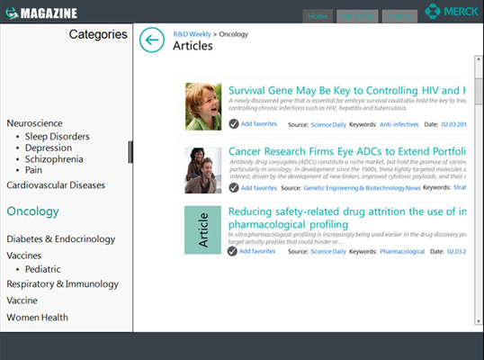
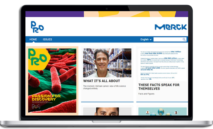
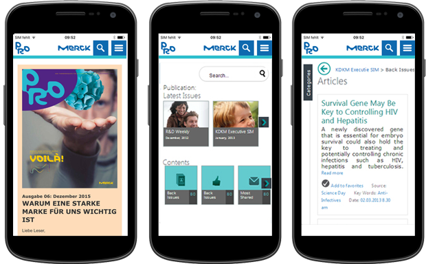
- Our simple and innnovative design facilitate to read articles and magazine across all platform web, tablet and mobile etc
- Our good design made sustainability in the sense that design and materials are durable and not just a trend.
