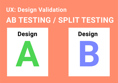
Comparing two different versions of a designs with different user group and see which version performs the best. AB testing can be done with any product, it can be Initial prototype design, live ecommerce website or any physical products.
Create hypothesis what you want to test with users and validate which performs best with respect to user achievement, understanding content and user satisfaction etc.
I describe briefly about AB testing approach in this video, Please watch it here.
We are people who create/ produce numerous products in different platform . It can be physical or digital product which is going to be use world people. People have different needs and expectations which is varied across world wide. if the product needs to be successful, it should satisfy end user who are going to purchase and use.
On initial stage product development, product development people should consider target audience needs and expectation and their own perspective. Product needs to be easy to use and satisfy the user.
Usability heuristic principle defined by Jacob Nielsen states as: Match between the system and the real world .
The system should speak the users’ language, with words, phrases and concepts familiar to the user, rather than system-oriented terms. Follow real-world conventions, making information appear in a natural and logical order .
•Let me explain about some examples, where this is relevant
The language
Most of the times the users are going to search for you on the internet or are going to navigate within your website using language that should be more natural to them.
Important steps needs to be considered on creating content and define the language
Target Audiennce should be addressed
Ensure You’re creating the right content, for the right people
Better understand how to create content that connect benefits to reader needs
Content what we create which needs to be conveyed through users own language its familiar to them, can be understandable easily, if the content is familiar, users will understand very fast , they don’t need to spend time to study, don’t need to put much cognitive load to understand system language
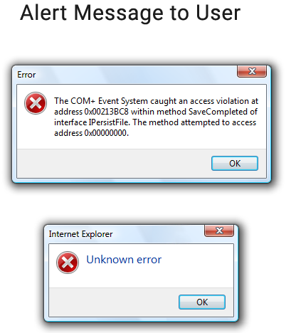
Messages to User
Error Message
Error messages like below one is not really very helpful for the end users. The screenshot of the Error message by Windows showing a bad match between the system and the real world
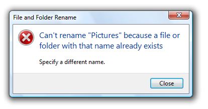
Instead, a improved error message like this, feels less threatening and creating confident to the users.
Visual Elements / Metaphor
It is good to have creativity, but there are some visual elements associated action, familiar to end users, creative should not kill users familiarity, we need to balance between creativity and usability
For example, a heart symbol associated for wish list Floppy disk for save, basket for cart, trash bin to delete and lot more familiar metaphor associated with certain actions.
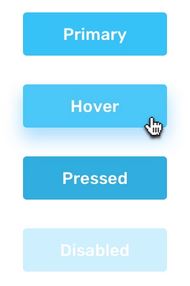
Buttons
UI elements should carry visual cue and affordance, example •A button should look like a button how the users earlier practiced and familiar. They should feel clickable. When a user clicks a button, it should feel that it has been “pressed”
Pictures and Graphics
Graphics, it is important to use the pictures or videos which match the target audience. The visual should reflect and attached with the target user culture and demographics so that user can feel they are in comfortable zone and we take care of them.
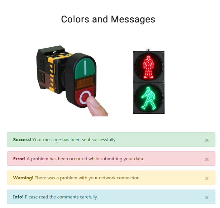
Colors and messages
Seeing the green color, on the contrary, feels like a correct action or a success. This is because beyond screen also, red and green are typically associated with Stop and Go respectively.
When users use a digital product, they may not know the technical jargons and processes associated at the backend.
If you disregard your users’ understanding, and language or imagery, that they do not understand, that can badly affect the whole user experience. We, humans, find great comfort in familiarity. If something is unfamiliar and non-understandable we feel fearful and doubtful.
User Centric Design(UCD) provides opportunity to demonstrate user research, empathy target users and match user needs. The design solution and system what you develop should match the real world which leads to loyal customer who value your efforts and increase return on investment.
kathirg.com | UX Design Project Management Consultant | Agile Scrum who coach empiricism framework from Chennai Tamilnadu India