+91 099622 56616
Showing 18 Result(s)

Simple and Aesthetic Design Makes User Comfortable

Aesthetic and minimalist design very important behavior we should adhere.

Why this is important in user interface, Our brain can only process limited information at a time.  •Sometimes, the interface is too cluttered with a lack of hierarchy. Which makes it very difficult to focus or function properly.

The aesthetic and minimalist design is the eighth guideline of Nielsen’s Heuristics 

Nielsen’s statement is, Dialogues should not contain information which is irrelevant or rarely needed. Every extra unit of information in a dialogue competes with the relevant units of information and diminishes their relative visibility. 

One main example would be the Information Processing Theory. Since already several decades, Miller presented the idea of chunks and of short-term memory,

Talking about what to visualize would essentially mean to take care about avoiding cluttering the users with extra and irrelevant information they might not need by keeping a clean interface that can catch and retain the user attention. However, there is not a black & white approach to determine what is really relevant and what is not. As a matter of fact, there are degrees of relevance. This implies the need for a prioritization of the information and actions shown. Strategies as progressive disclosure are providing solutions to this problem.

At this point comes in place the how. Eventually, the information should not only be visualized with appropriate styles, but also the location on the interface plays a critical role. The devices we have to deal with come with constraints in size, so the importance to be aware of how to arrange elements and interactions. We should try taking advantage of what nowadays users are already experiencing. For example, having a vertical layout means to have the first section, as big as the size of the screen, which will have a higher priority compared to the rest of the view, since to access the rest of the page the user has to go through another interaction first. This is called above the fold and more details can be found in many specialized UX blogs. Other aspects to take care of are the noise of too many information items. Or having many items pointing the same action and creating redundancy on the page. Finally another aspect is to take care about the functionality and what each item represents and should be triggering. All these aspects are strictly related to the users habits.

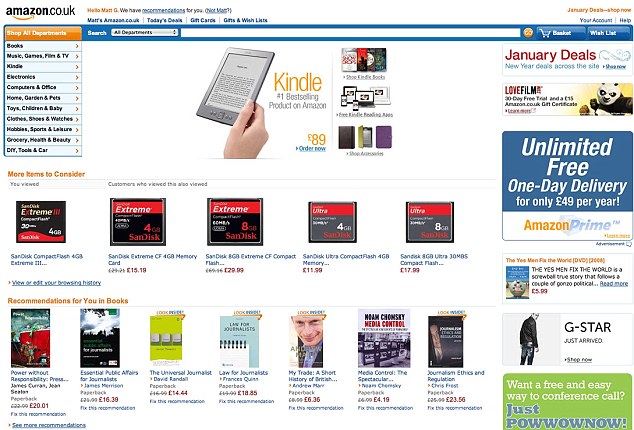
One of the main extreme example provided by most of the online learning material takes into account the Google homepage, where mainly we have only the search bar and really few more possible interactions.

Here we can see two examples of websites taken from Web design-Inspiration. A platform that gathers well-designed websites as a portfolio.

Flat Patterns and Textures Used in 96% of sampled interfaces (but often ineffectively) Over the past few years, there has been an overwhelming shift in the design community away from skeuomorphism, towards purely digital representations of things without physical metaphors. Flat interfaces don’t make use of any of the obvious highlights, shadows, gradients, or other textures that make UI elements look glossy or three-dimensional.

Flat designs often fail to communicate to users which elements are selectable or clickable. We believe that a better approach is a compromise between flat and skeuomorphic—a mostly flat design, but with clickable elements that users can recognize easily.

Limited or Monochromatic Color Palette

Used in 95% of sampled interfaces

•In most minimalist interfaces, color is used strategically to create visual interest or direct attention without adding any additional design elements or actual graphics.

With less visual information vying for a user’s attention, color palettes are more noticeable and will be more influential in a site’s impact. •Minimalist color palettes are a movement away from the clashing, loud colors of the web design popular in the 2000s.  Subdued color schemes are intended to avoid upstaging the content—which, in the case of images, can still be brightly colored.

•Many minimalist designs are either monochromatic, or use only one bold color as an accent, and use it to—sparingly—highlight the most important elements of the site. These accented elements are usually clickable. •When assessing the use of color in the sample websites, we looked at background colors, logos, navigational elements, iconography, and typography, but did not consider content images (like photographs) as part of the color palette. •Almost half of the websites sampled (49%, 55 websites) used a monochromatic color palette. Almost as many websites used one or two accent colors in an otherwise monochromatic color palette (46%, 52 websites). Of those 55 monochromatic sites, 51 sites were grayscale-–they used exclusively white, black, and gray shades.

•Many minimalist designs are either monochromatic, or use only one bold color as an accent, and use it to—sparingly—highlight the most important elements of the site. These accented elements are usually clickable. •When assessing the use of color in the sample websites, we looked at background colors, logos, navigational elements, iconography, and typography, but did not consider content images (like photographs) as part of the color palette.

•Almost half of the websites sampled (49%, 55 websites) used a monochromatic color palette. Almost as many websites used one or two accent colors in an otherwise monochromatic color palette (46%, 52 websites). Of those 55 monochromatic sites, 51 sites were grayscale-–they used exclusively white, black, and gray shades.

The popularity of this particular characteristic is an improvement in the sense that it’s moving interfaces away from the loud, clashing color schemes that used to dominate the web. However, there are some considerations to keep in mind when applying a limited color palette: Make sure your color scheme uses enough contrast to be legible to people with limited vision or color blindness. Use accent colors intentionally and consistently to highlight very important information or primary actions.

Restricted Features and Elements

Used in 87% of sampled interfaces Designers who adopt a minimalist design strategy must consider each element in their interfaces and eliminate any that are not required to support the core functionality or message of the website. An ‘element’ in this context could be any individual unit of the interface: including but not limited to: menu items, Links, images, graphics, lines, captions, textures (like gradients) Colors, fonts, icons. It’s difficult to assess whether an interface includes ‘unnecessary’ elements without directly asking the sites’ designers what they left out, and without knowing the target users and tasks. To make this characteristic measurable, we focused on assessing whether or not the interface contained graphic elements that did not serve any obvious purpose. In our sample, 87% of minimalist sites avoided gratuitous graphic elements.

The more stuff there is in a user interface, the more stuff users need to process. A favorite mantra of minimalist designers is, “subtract it till it breaks,” which really means, “unless the absence of an element would be serious problem, get rid of it.”

This is where designers can get distracted by the pursuit of a clean, modern, minimalist interface—and end up cutting out useful content. Adhering to a rigidly utilitarian approach can produce streamlined designs by eliminating distracting features and content. Just make sure you aren’t making your users’ primary tasks more difficult by removing or hiding content they need.

It’s hard to understand a cluttered design or a system overflowing with extraneous features. But it’s even harder to understand a design that doesn’t provide sufficient scaffolding to explain its features or structure.

Maximized Negative Space

Used in 84% of sampled interfaces Removing or excluding elements from a web page necessarily leaves empty space. Negative space (also called white space) is the name given to the empty areas of an interface. Negative space has been called “practically synonymous with” and “the backbone of” minimalist interfaces. Many minimalist designers use it as a tool to try to direct users’ attention and allow them to digest content more easily. Considering these strong assertions of negative space as the defining characteristic of minimalism, it’s surprising that only 84% of the sample sites used substantial amounts of negative space in their designs.

Dramatic Use of Typography

Used in 75% of sampled interfaces •Like color, bold or large typography becomes another tool for communicating meaning when there are few elements on the page. Effectively exploiting interesting typography can help compensate for having fewer elements like photos and graphics, and can make a minimalist design feel more visually engaging. Variations in font size, weight, and style become crucial in helping users understand the hierarchy and relative importance of text. Of the 112 sampled minimalist sites, 75% used typography to convey meaning or create visual interest.

The portfolio of art director Alexander Engzell uses bold typography on his tagline to create visual interest without adding extra graphic elements to the page. However, the text is an image file, which adds to page load time. Also, unlike the Buffet portfolio, this page doesn’t directly explain whose portfolio this is, or what this person does. Users have to click the INFO link in the upper right corner to access that information. Using images for text may allow you to use custom fonts, but it will add to page load time, will require extra considerations for scaling at different resolutions, and can cause accessibility issues. Using web fonts is a better solution, but bear in mind that web fonts can have detrimental performance effects as well. Remember, drawing attention to bold typography is only useful when that text communicates meaningful information. Beware of going overboard on the fancy typography: users can ignore overformatted text if it looks too much like advertising. There’s a delicate balance between meaningfully bold typography and distracting typography. A great designer will come down on the right side of this balance, but if your designers are less skilled in employing advanced typography it’s safer to err on the side of caution.

Grid Layouts

Used in 43% of sampled interfaces, In our sample, we found that 43% of the interfaces used grid layouts to organize content. While this percentage indicates it is a popular design pattern among minimalist designers, it seems that grid layouts are certainly not ubiquitous in their designs. When grid layouts are used in minimalist UI designs, it’s generally for two reasons: Grids are an effective method of organizing homogenous content on the page linearly without adding any visual elements; and Grids are particularly helpful when designing a responsive website — another trend that is separate from minimalism but often co-occurs with minimalism.

Hidden Global Navigation

Used in 13% of sampled interfaces •Many websites currently use severely reduced global navigation elements in their desktop presentations, such as the now infamous hamburger menu. This can sometimes be the result of an incomplete mobile-first design strategy that fails to consider the needs and extra screen space available to desktop users, but it can also result from overzealous minimalism. Hiding infrequently accessed items might make sense for your goals, but make sure you aren’t hiding tools or links that are critical to the tasks you want your users to perform. Be particularly cautious if your site has large amounts of content or categories.

Summarized Characteristics of Minimalist Interfaces

  • Our analysis of 112 websites revealed the following defining characteristics for a minimalist website:
  • Use of a limited or monochromatic color palette
  • Strictly limited features and graphic elements
  • Maximized negative space
  • Dramatic use of typography to communicate hierarchy or create visual interest
  • Some of these characteristics are used almost ubiquitously in minimalism, and some occur slightly less frequently in minimalist interfaces; however, all of the defining characteristics were present in at least 75% of the minimalist sites that we analyzed.
  • In our research, we also identified several related trends that were present in less than 75% of the sampled sites.
  • Large background images or videos
  • Grid layout
  • Circular graphic elements
  • Hidden global navigation

Heuristic Principles – Best Practices

1 Visibility of system status

  • Feedback: keep user informed about what goes on
  • Provide status information
  • Feedback: show that input has been received
  • Features change as user carries out task
  • Feedback provided for all actions
  • Feedback timely and accurate
  • Indicate progress in task performance
  • Direct manipulation: visible objects, visible results
  • Identity cues system response vs. user’s goal
  • Show icons and other visual indicators
  • WYSIWYG; do not hide features

2 Match between system and the real world

  • Speak the user’s language
  • Contains familiar terms and natural language
  • Metaphors from the real world
  • Familiar user’s conceptual model
  • Use of user’s background knowledge

3 User control and freedom

  • Undo e redo should be supported
  • Obvious way to undo actions
  • Forgiveness: make actions reversible
  • Ability to undo prior commands
  • Clearly marked exits
  • Ability to re-order or cancel tasks
  • Modeless interaction
  • User control: allow user to initiate/control actions

4 Consistency and standards

  • Consistency: express same thing same way
  • Consistency: same things look the same
  • Uniform command syntax
  • Conform to platform interface conventions
  • Show similar inf. at same place on each screen

5 Error prevention

  • Prevent errors from occurring in the first place
  • System designed to prevent errors
  • What planning mistakes are most likely ?

6 Recognition rather than recal

  • See-and-point instead of remember-and-type
  • Make the repertoire of available actions salient
  • Seeing and pointing: objects and actions visible
  • What features often missed and at what cost ?
  • Provide list of choices and picking from list
  • Minimise the user’s memory load
  • Easy or difficult to perform (execute) tasks ?
  • Allow access to operations from other applications
  • Show icons and other visual indicators

7 Flexibility and efficiency of use

  • Shortcuts: Accelerators should be provided
  • User tailorability to speed up frequent actions
  • User interface should be customisable

8 Aesthetic and minimalist design:

  • Design should be Aesthetic
  • Navigation and buttons should be affordance
  • Design should be intuitive
  • Clutter free
  • Interface should have visual cue and affordance
  • Affordances provide strong clues to the operations of things.

9 Help users recognize, diagnose, and recover from errors

  • Error and Exception Handling

10 Help and Documentation

  • Help and Documentation should be available

Recognition rather than Recall- Example

User are encountered to interact various people and products where they want to feed input and get output daily basis , during this interaction they easily recognize things which they want to interact or sometime they use memory to retrieve relevant information continue interaction. So there are two parts involved each interaction which are recognition and recall. The first one recognition happens easily based on familiarity, second one recall requires memory process which can be varied based on contextual. To make ease of interaction and improve good user experience, cognitive load needs to be reduced.

The Nielsen statement as follows

Recognition rather than recall

Minimize the user’s memory load by making objects, actions, and options visible. The user should not have to remember information from one part of the dialogue to another. Instructions for use of the system should be visible or easily retrievable whenever appropriate.

Example , you open outlook mailbox there find mail list , send mail, reply button everything upfront ,you can easily recognize and interact with the tool where users don’t use use much memory .but another example if user use command line tool where want to change  filename or folder name, required memory to retrieve the commands to change filename. The memory of data retrieval depends other factors, memory will be effective based on activation of data which involves practice and recency of usage, context. 

Memory activation is depends upon amount of practice you do,  recency how far away you practiced the data, context how the data interconnected with other memory.

Context is based on association, example most of people create passwords with other associated data, like name with data of birth, or combination of first and last name to make ease of memory.

Recall on interface requires memory load which may increase cognitive load and its leads frustration when interact with system. Creating recognition based user interface and its components which would be reduced memory process and leads friction less interaction.

Promote Recognition in User Interfaces

How do you promote recognition? By making information and interface functions visible and easily accessible.

A product usually has two components:

  • The Interface: the combination of buttons, navigation, and other elements which help the user reach his goal
  • Content information that the user needs to achieve his goal

You can make both the content and the interface easy to remember; both can benefit from designing for recognition rather than recall. Some examples can be listed which would supporting retrieval of information through recognition.

E commerce websites, Google listing history, items recently visited and searches performed in the near past.

These screenshots reveal the humble beginnings of some of the world’s biggest websites. The homepages of internet heavy-hitters like Amazon, Twitter and Youtube – which receive millions of hits per day – at the time of their launches are almost unrecognisable to today’s web users. These early versions of some of the world’s most clicked-upon sites look incredibly basic compared to their present-day counterparts. With their plain colour schemes and emphasis on text rather than images, it’s hard to believe that they developed into the colourful, content-heavy pages that millions log on to every day. (Credit; newsteam).

Visible, Intuitive Graphic User Interface

Command-line interfaces are an example of interfaces that are based on recall. Graphical user interface that are based on recognition which would have visible, intuitive graphical elements.

Top 10 websites to help you improve User Experience design Knowledge

User experience design is one of the trending and matured field to help people Understand design problems and developing solutions. User experience the term coined by Don Norman, UX design mentor who teach the world User experience design principle and guidelines to follow. Nowadays almost all product developer and manufacture eagerly looks into User and Customer insights , feedback and problems what they face when interact with product to improve next level good user experience design.

Following are some of the top websites deliver UX content periodically

1. Alert Box –  Nielsen Norman Group

NNG is the trusted long-running authority in all things UX. The articles are extremely insightful and always backed up with detailed research and examples to illustrate arguments. For a weekly fix, subscribe to their “Alertbox newsletter.” You won’t regret it.

2. UX Booth

UX Booth is an extremely high-quality and thorough blog. Quality is the key word here. Authors bring unique insights and perspectives to thought-provoking arguments. Articles are long but full of well-researched content, references, and suggestions for further reading.

3. UX Pin

UX Pin is a wireframing/prototyping product with a great blog embedded in their site. The content is interesting and relevant but keep an eye out for the free e-books. These are outstanding resources that are showcased on the blog. You can also find the whole collection here. Did I mention they are free?

4. UX Magazine

A staple in any UX designer’s reading list. This consistent blog has a huge variety of content for designers at any level. Here you will find anything from “how to” posts to opinion pieces and no matter what, UX will always be front and center.

5. A List Apart

Written for “people who make websites” with a focus on web standards and best practices. The site contains both a blog and longer format articles. The content in both sections are extremely well curated and high-quality material. However, if you’re looking for UX design specific content you may have to hunt around a bit. While hunting though, make sure to to explore headlines outside the field for some added industry context.

6. Usability.Gov

Usability.gov is the one-stop source for user experience Process, Principles and  best practices. Learn how to create more usable, useful, and accessible websites to enhance your user experience

7. Usabilla

Usabilla is a product for user feedback, but they publish a blog on their site as well. The posts are always unique and interesting, but the real gem is their monthly “best of” articles. The “best of” is a compilation series that highlights insightful articles from around the web, typically from smaller or more niche sources.

8.  Smashing Magazine

This is a classic resource for anyone in the technology industry. Dig into the “UX Design” category for a focused set of articles but explore the other offerings throughout the magazine as well. It will only help round you out as a designer the more you explore.

9. Design Shack

Established in 2003, Design Shack showcases inspiring examples of design, alongside resources and articles that teach you how to succeed.

This blog attracts a wide audience comprising agencies, designers, businesses, organizations, and individuals who are passionate about cutting edge web design technologies and design news.

10. Mindtreasury

Mindtreasury offers user experience design consultation service along with development, project management strategic support. They are bring solutions to customers to maximize customer experience and improve Return on investment. Here you will learn practical guide to implement how to implement ux best practices in legacy environment, click here to learn more

Heuristic Principle Explained: Match between system and real world

We are people who create/ produce numerous products in different platform . It can be physical or digital product which is going to be use world people. People have different needs and expectations which is varied across world wide. if the product needs to be successful, it should satisfy end user who are going to purchase and use.

On initial stage product development, product development people should consider target audience needs and expectation and their own perspective. Product needs to be easy to use and satisfy the user.

Usability heuristic principle defined by Jacob Nielsen states as: Match between the system and the real world .

The system should speak the users’ language, with words, phrases and concepts familiar to the user, rather than system-oriented terms. Follow real-world conventions, making information appear in a natural and logical order .

•Let me explain about some examples, where this is relevant

The language

Most of the times the users are going to search for you on the internet or are going to navigate within your website using language that should be more natural to them.

Important steps needs to be considered on creating content and define the language

  • Target Audiennce should be addressed
  • Ensure You’re creating the right content, for the right people
  • Better understand how to create content that connect benefits to reader needs

Content what we create which needs to be conveyed through users own language its familiar to them, can be understandable easily, if the content is familiar, users will understand very fast , they don’t need to spend time to study, don’t need to put much cognitive load to understand  system language

Messages to User

Error Message

Error messages like below one is not really very helpful for the end users. The screenshot of the Error message by Windows showing a bad match between the system and the real world

Instead, a improved error message like this, feels less threatening and  creating confident  to the users.

Visual Elements / Metaphor

It is good to have  creativity, but there are some visual elements associated action, familiar to end users, creative should not kill users familiarity, we need to balance between creativity  and usability

For example, a heart symbol associated for wish list Floppy disk for save, basket for cart,  trash bin to delete and lot more familiar metaphor associated with certain actions.

Buttons

UI elements should carry visual cue and affordance, example •A button should look like a button how the users earlier practiced and familiar. They should feel clickable. When a user clicks a button, it should feel that it has been “pressed”

Pictures and Graphics

Graphics, it is important to use the pictures or videos which match the target audience. The visual should reflect and attached with the target user culture and demographics so that user can feel they are in comfortable zone and we take care of them.

Colors and messages

Seeing the green color, on the contrary, feels like a correct action or a success. This is because beyond screen also, red and green are typically associated with Stop and Go respectively.

When users use a digital product, they may not know the technical jargons and processes associated at the backend.

If you disregard your users’ understanding, and language or imagery, that they do not understand, that can badly affect the whole user experience. We, humans, find great comfort in familiarity. If something is unfamiliar and non-understandable we feel fearful and doubtful.

User Centric Design(UCD) provides opportunity to demonstrate user research, empathy target users and match user needs. The design solution and system what you develop  should match the real world which leads to loyal customer who value your efforts and increase return on investment.

Agile Scrum Roles

Scrum – A framework within which people will play roles in predefined roles

The roles can not be changed or modified because scrum immutable.

The Scrum Team consists of a Product Owner, the Development Team, and a Scrum Master. Scrum Teams are self-organizing and cross-functional. Self-organizing teams choose how best to accomplish their work, rather than being directed by others outside the team. Cross-functional teams have all competencies needed to accomplish the work without depending on others not part of the team. The team model in Scrum is designed to optimize flexibility, creativity, and productivity. The Scrum Team has proven itself to be increasingly effective for all the earlier stated uses, and any complex work.

The Product Owner

  • The Product Owner is responsible for maximizing the value of the product resulting from work of the Development Team
  • The Product Owner is the sole person responsible for managing the Product Backlog. Product Backlog management includes:
  • Clearly expressing Product Backlog items;
  •  Ordering the items in the Product Backlog to best achieve goals and missions;
  • Optimizing the value of the work the Development Team performs;
  • Ensuring that the Product Backlog is visible, transparent, and clear to all, and shows what the Scrum Team will work on next; and,
  • Ensuring the Development Team understands items in the Product Backlog to the level needed.
  • For the Product Owner to succeed, the entire organization must respect his or her decisions. The Product Owner’s decisions are visible in the content and ordering of the Product Backlog. No one can force the Development Team to work from a different set of requirements.

The Development Team

  • The Development Team consists of professionals who do the work of delivering a potentially releasable Increment of “Done” product at the end of each Sprint.
  • A “Done” increment is required at the Sprint Review. Only members of the Development Team create the Increment.
  • Development Teams are structured and empowered by the organization to organize and manage their own work. The resulting synergy optimizes the Development Team’s overall efficiency and effectiveness.
  • Development Teams have the following characteristics:
  •  They are self-organizing. No one (not even the Scrum Master) tells the Development Team how to turn Product Backlog into Increments of potentially releasable functionality;
  • • Development Teams are cross-functional, with all the skills as a team necessary to create a product Increment;
  • • Scrum recognizes no titles for Development Team members, regardless of the work being performed by the person;
  • • Scrum recognizes no sub-teams in the Development Team, regardless of domains that need to be addressed like testing, architecture, operations, or business analysis; and,
  • • Individual Development Team members may have specialized skills and areas of focus, but accountability belongs to the Development Team as a whole.
  • Team-size: Optimal Development Team size is small enough to remain nimble and large enough to complete significant work within a Sprint. Fewer than three Development Team members decrease interaction and results in smaller productivity gains. Having more than nine members requires too much coordination. Large Development Teams generate too much complexity for an empirical process to be useful.

The Scrum Master

  • The Scrum Master is responsible for promoting and supporting Scrum as defined in the Scrum Guide. Scrum Masters do this by helping everyone understand Scrum theory, practices, rules, and values.
  • The Scrum Master is a servant-leader for the Scrum Team. The Scrum Master helps those outside the Scrum Team understand which of their interactions with the Scrum Team are helpful and which aren’t. The Scrum Master helps everyone change these interactions to maximize the value created by the Scrum Team.

Scrum Master Service to the Product Owner

The Scrum Master serves the Product Owner in several ways, including:

  • Ensuring that goals, scope, and product domain are understood by everyone on the Scrum Team as well as possible;
  • Finding techniques for effective Product Backlog management;
  • Helping the Scrum Team understand the need for clear and concise Product Backlog items;
  • Understanding product planning in an empirical environment

Scrum Master Service to the Development Team

The Scrum Master serves the Development Team in several ways, including:

  • Coaching the Development Team in self-organization and cross-functionality;
  • Helping the Development Team to create high-value products;
  • Removing impediments to the Development Team’s progress;
  • Facilitating Scrum events as requested or needed;

Scrum Master Service to the Organization

  • The Scrum Master serves the organization in several ways, including:
  • Leading and coaching the organization in its Scrum adoption;
  • Planning Scrum implementations within the organization;
  • Helping employees and stakeholders understand and enact Scrum and empirical product development;
  • Causing change that increases the productivity of the Scrum Team; and,

Agile Scrum Framework – How it Works

What is Scrum

  • Scrum is a subset of Agile. It is a lightweight process framework for agile development, and the most widely-used one.
  • Scrum existed before Agile.
  • Scrum respects the Agile Manifesto.
  • Scrum framework within which people can address complex adaptive problems, while productively and creatively delivering products of the highest possible value.
  • Scrum is: • Lightweight • Simple to understand but Difficult to master
  • The Scrum framework consists of Scrum Teams and their associated roles, events, artifacts, and rules.
  • Implementing only parts of Scrum is not Scrum. Scrum is immutable. Scrum needs to be adhered exactly what prescribed in scrum framework
  • Each component within the framework serves a specific purpose and is essential to Scrum’s success and usage.
  • It divides complex problems into a small scope of short term iterations. For each iteration, just enough work is planned that can be completed within that short iteration of a few weeks. There is no big scope of work spanning a long duration.
  • Scrum is founded on empirical process control theory, or empiricism. Empiricism asserts that knowledge comes from experience and making decisions based on what is known. Scrum employs an iterative, incremental approach to optimize predictability and control risk.
  • It uses a small team to perform these few weeks of work. It requires them to increase the visibility of work or product information as they travel this iteration.
  • The small team creates a product Increment which is a usable outcome, at the end of these few weeks. The Increment is shared with stakeholders for inspection and feedback is solicited
  • From this feedback and experience, new clarity emerges and knowledge is obtained. The scope and plan for the next iteration is adjusted based on this new knowledge.
  • You can equate the traditional “trial and error” model to empiricism. Each iteration is a trial to solve a problem and gain more clarity.
  • Reducing risk increases the probability of meeting the goal. So, empiricism applies an iterative, incremental approach to optimize predictability and control risk.
  • Scrum has been used to develop software, hardware, embedded software, networks of interacting function, autonomous vehicles, schools, government, marketing, managing the operation of organizations and almost everything we use in our daily lives, as individuals and societies

Scrum Pillars

  • The three pillars of empiricism are the heartbeat that upholds every implementation of the empirical process control.

The pillars are

  • Transparency,
  • Inspection, and
  • Adaptation

Transparency

Transparency requires that significant aspects of the process be visible and defined by a common standard so stakeholder and scrum team share a common understanding of what is being seen and working

A common language referring to the process must be shared by all participants; and,  Those performing the work and those inspecting the resulting increment must share a common definition of “Done”.

So, The definition of “Done” is a standard for ensuring Transparency.

Inspection

Inspection requires that Scrum users frequently inspect the Scrum artifacts and progress towards a Sprint Goal to detect undesirable variances.

Their inspection should not be so frequent that inspection gets in the way of the work. Inspections are most beneficial when diligently performed by skilled inspectors at the point of work.  we can inspect through the scrum event  and most frequently as possible.

Adaptation Adaptation requires that, in the event of unacceptable variances, the Scrum Team must make adjustments as soon as possible to minimize further deviation.

Scrum prescribes four formal events for inspection and adaptation, as described in the Scrum Events.

Scrum Values

The Scrum Team lives by Scrum Values so that the Scrum Pillars come to life.

Scrum values are a set of fundamental qualities underpinning the Scrum framework;

Scrum five values: commitment, courage, focus, openness, and respect. Being proficient in living these values brings the Scrum pillars of Transparency, Inspection, and Adaptation to life and builds trust for everyone.

The Scrum Team members learn and explore these values as they work with the Scrum events, roles, and artifacts. These values are seen as another checkpoint to compare the behavior within the Scrum Team to see if the behavior reflects the understanding or just the mechanics.

  1. Commitment : Commitment of every team member to achieve the goals of the Scrum Team. Commitment in following the pillars of empiricism and self-organization and using them to achieve the goals.
  2. Courage: Courage to work on tough problems. Courage to do the right thing by accepting that the future cannot be predicted and responding to emerging change. Courage helps everyone to be grounded in reality not giving into personal pride.
  3. Focus : Focus of the team on prioritizing and completing the Sprint work to achieve the goals of the Scrum Team. Focus helps to avoid doing other things not related to the Sprint Goal.
  4. Openness: Openness of the Scrum Team and its stakeholders in expressing and facing the facts and truths about all the work and challenges with performing the work, thereby increasing transparency. Openness to collaborate with others with the highest amount of transparency.
  5. Respect: Respect each other as capable and independent people so that it can provide a trustworthy environment to learn and share.
  • Successful use of Scrum depends on people becoming more proficient in living these five values.
  • People personally commit to achieving the goals of the Scrum Team.
  • The Scrum Team members have courage to do the right thing and work on tough problems. Everyone focuses on the work of the Sprint and the goals of the Scrum Team. The Scrum Team and its stakeholders agree to be open about all the work and the challenges with performing the work.
  • Scrum Team members respect each other to be capable, independent people.